The color of the internet
What nail polish, house paint and Crayola crayons say about the shades of online existence
Hi friends — I’m trying something new today that I’m very excited (and only moderately self-conscious!) about. It’s a visual essay on internet colors, inspired by … last season’s nail polish. 🙃
FYI, if your email provider strips images from emails, you’ll have to disable that setting to view this. You can also view this essay on the much-neglected Links Instagram and read full source information in the footnotes.1
Also, before anyone fact-checks me on the pictured old-school computers — because I know someone will, most likely my dad — plz understand these as decorative elements. I’m working within the constraints of public domain images.
Thanks, as always, for giving me the space to try new things. This was fun! I’ll see you this weekend for our regularly scheduled program.
Warmest virtual regards,
Caitlin
First off: I would not even know visual essays were a thing if not for the work of my fellow Buffalonian Ariel Aberg-Riger, a genius and inspiration.
Images in these collages are almost entirely public domain and came from the Internet Archive, Wikimedia Commons, the Ohio University Libraries (via Flickr) and Vanja Matijevic, Kari Shea, Alexander Andrews, Annie Spratt, Behnam Norouzi, Jason Leung and Copper & Wild (via Unsplash).
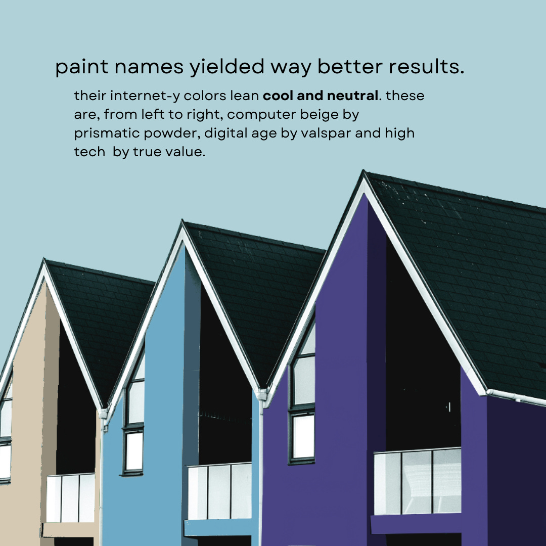
I found Crayola crayons and X11 colors on Wikipedia, Pantone colors on Github and paint colors on myperfectcolor.com. Mozilla has a good write-up on why links are were blue, Alex Sexton gave a 2014 talk on early color-naming conventions and Paul Hebert’s project lives at this address.
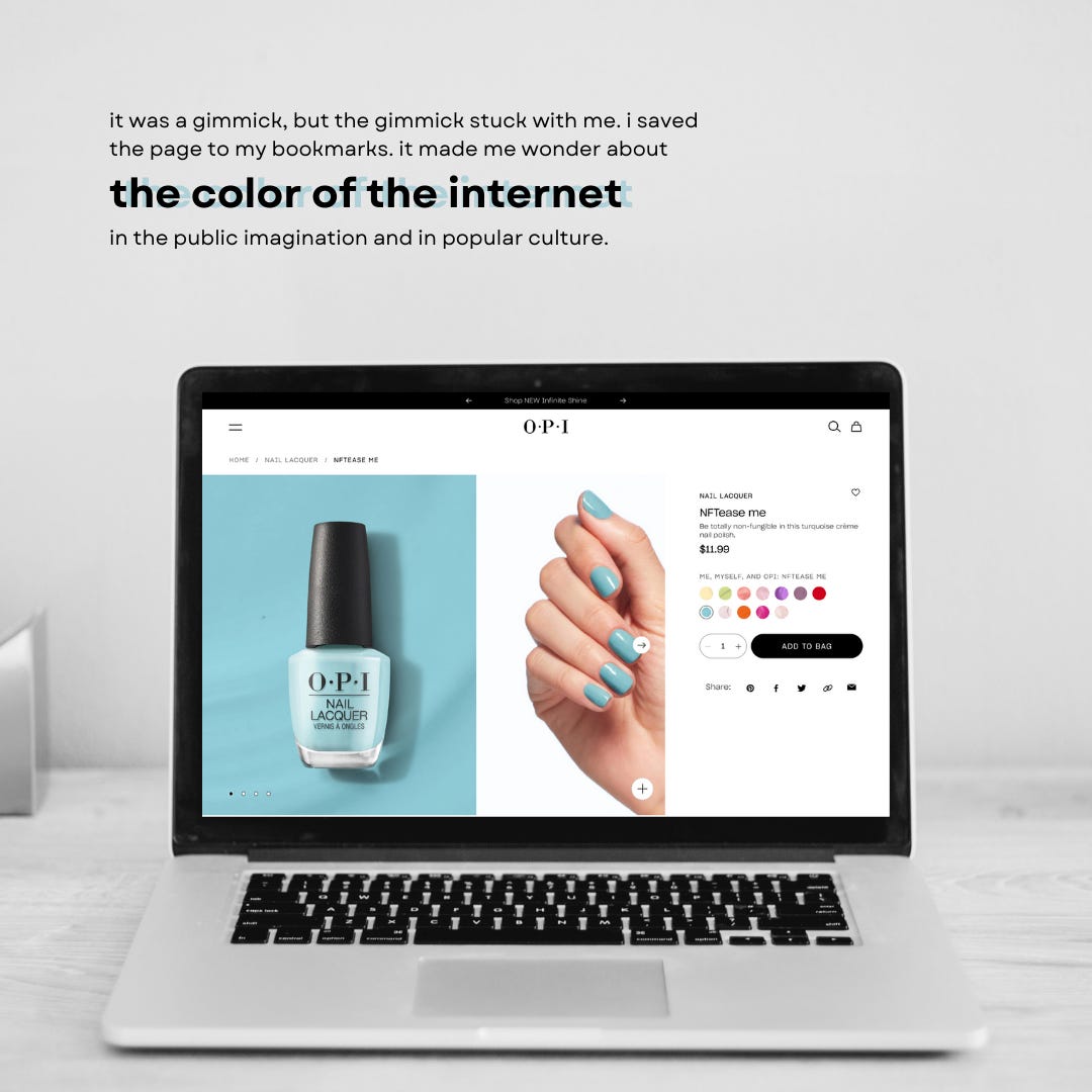
FINALLY, the nail polish. You’re curious, yeah? It’s called “Me, Myself and OPI.” (Lol.) I am kiiiinda partial to NFTease Me — “putting the ‘fun’ in ‘nonfungible’” — though this is the only context in which I will purchase anything related to crypto.


I stared at that Pantone slide for way too long. I had read "online lime" as "orange lime" at first and was like "but it's green"? Really thought it was The Dress all over again.
Just delightful! You whisked me back to the days of web-safe colors. My company's website at the time had data charts that looked like the circus had come to town!